Know where to save ...
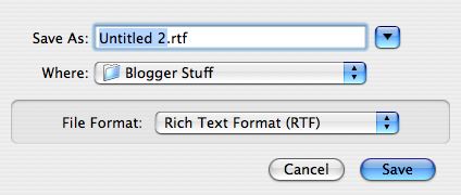
What does the single downward-pointing arrow do in the above picture ... (a save dialog box)?
Echo from drunkenbatman:
I encourage people to be proficient and efficient computer users. The majority of them fall into the "those who are afraid" category. But this one is not their fault. It's bad design.There are two distinct types of users: Those who go in and click everything to see where it takes them and what it does, and those who are afraid of clicking anything at all for fear of getting into something they won't understand or screwing up what they'd set out to do. In the first case, the user will have clicked the triangle and seen that they'll get a larger panel, but the latter group may never even know it exists.
The first thing I say to new adult users (kids rarely have this fear) is "Don't be afraid, click everywhere, right-click everywhere." The second is "When you go to save a document, click that little triangle so you have some idea of where you are and where you can save your document. I have no idea why Apple thinks this is a useful default."
0 Comments:
Post a Comment
<< Home